This page will guide you through Flexmonster’s default UI.
Note In case some feature is missing from the component, please check whether it is available for your data source in the technical specifications.
If necessary, the UI can be customized and adjusted to your project’s needs. For example, you can disable existing features, manage UI controls, and change Flexmonster’s theme. Refer to the customizing section for all customization options.

When using the grid, users can:
Check out our video tutorial:
The Toolbar is a convenient collection of the most commonly used API calls:
Esc.Number formatting can be applied through the Format cells pop-up window. To open this pop-up window, choose Format () > Format cells () in the Toolbar. Select a value from the drop-down list to apply the chosen format to it. Then, you can modify any of the following properties: text alignment, thousand separator, decimal separator, decimal places, currency symbol, currency align, null value, and format as a percentage.
The conditional formatting pop-up window can be opened by choosing Format () > Conditional formatting () in the Toolbar. In the pop-up window, click the plus icon to add a new condition. You can apply the condition either to all values or to a specific measure from the drop-down list. Select the condition type and value, font family, and size. Click the A-letter icon to change the default font and background colors. Choose new colors from the color picker or enter their hex codes. Click APPLY to add these colors to the condition. You can see a preview of the result inside the box on the right. To see the result on the grid, click APPLY. You can remove the condition by clicking the recycle bin icon on the right of the condition.
Check out our video tutorial:
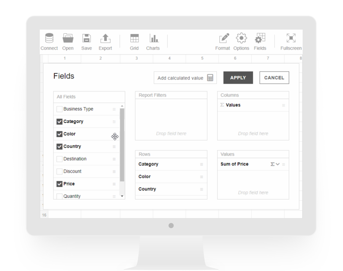
The Field List can be used to define which data is shown on the grid or charts. Access the Field List from the Toolbar or by clicking the diagonal arrow in the upper-right corner of the grid or the charts. You can resize the Field List using its window borders.
On the left side of the Field List, you will see a box with all fields from your dataset. This box also provides the following features:
To define which data to show in the component, drag fields to Rows, Columns, Values, or Report filters boxes. Fields can also be dragged between the boxes or inside them. Each box can have as many fields as you wish. It is also possible to include any level of a hierarchy, as well as all its sub-levels, in rows or columns.
Values are typically placed in columns but can also be dragged to rows. Each value has an aggregation function applied to it. Depending on the data source type, numeric fields support different aggregation functions. String and date fields can also be selected for values.
By default, numeric, string, and date fields are aggregated using the sum, count, and max functions, respectively. To change the aggregation function, click the sigma icon and choose a new aggregation.
Use the Add calculated value button at the top of the Field List to add a calculated value.
You can configure the Field List position, post-initialization behavior, and interface settings. See Manage the Field List section for details.
Check out our video tutorial:
Flexmonster provides an interface for adding and editing calculated values. To add a calculated value, open the Field List and click Add calculated value.
In the pop-up window, enter a value name, then compose a formula: drag the existing values into the formula box and apply arithmetic operators to them. Select the Calculate individual values checkbox to calculate the formula using raw values.
Click APPLY to add your value to the Field List. The new value will be already selected in the Values box and ready to be displayed in the component.
All calculated values are grouped under the Calculated Values folder in the All fields box. To edit a calculated value, click the sigma icon next to the value name. To remove the calculated value, click the recycle bin in the editing pop-up window.
Check out our video tutorial:
Visualize your data using the pivot charts:
Check out our video tutorial:
Fields can be filtered using the filter view. To open it, click the field’s name or use the field’s context menu. You can resize the filter view using its window borders.
The filter view contains the following configurations:
Under the field’s name, there are options to filter by. Depending on your data source and the field’s type, you can filter the field by members (labels, dates, or time) and values. See which filtering options are available for your data source.
Clicking a filtering option opens a subview, where you can:
To close the subview without changing the filter settings, click the filtering option again.
To save the filter configuration, click the APPLY button.
AZ and ZA toggle buttons sort field members in alphabetical and reverse alphabetical orders.
To display members in unsorted order, deselect an active toggle.
To save the filter configuration, click the APPLY button.
Decide which members to show on the grid and charts by choosing them in the list of field members. To select or deselect all members at once, use the Select all checkbox. Additionally, you can find field members by name using a search box.
To save the filter configuration, click the APPLY button.
You can also use a member's context menu to hide the member or show only its data.
Check out our video tutorial:
A specific row or column on the grid can be sorted using sorting arrows.
In the compact and classic (tabular) forms, the sorting arrows appear when hovering over member names or total cells. Click the arrow the first time to sort in descending order and the second time for ascending. You can also manage sorting through the context menu of each field member or total cell. All sorting can be removed via the context menu as well.
In the flat form, the arrows appear when hovering over field headers. Check out how sorting is applied:
"string" type: click the first time to sort in ascending order, the second time for descending, and the third time to remove sorting.In addition, the flat form allows sorting multiple columns at once. Press and hold Ctrl (Command on macOS) and click a sorting arrow on each column you want to sort.
Check out our video tutorial:
Each grid cell or graphical chart element represents one or more data records. To show details for a value cell or a graphical chart element, double-click it or use its context menu. A pop-up window will appear with the list of records composing the value. At the top of the pop-up window, you can see some details about the value: the column name, row name, and the value itself.
The Field List is available for this pop-up window as well. Use it to add or remove fields from the drill-through view without changing the slice for the grid.
Check out our video tutorial:
Right-click a grid cell or a chart element to open a context menu. It provides quick access to actions depending on the element selected:
Check out our video tutorial:
The auto-calculation bar provides quick calculations for the selected cells. Select the necessary cells on the grid to calculate their average, count, and sum. The cells can be selected either as an area or separately by using Ctrl + click (Command + click on macOS). This feature is available for the compact, classic (tabular), and flat forms, as well as for the drill-through view.
Here is a demonstration of how the auto-calculation bar works:
