


How to Use Flexmonster Pivot Grid for Stock Market Analysis
Nowadays, data is an important part of almost every decision-making process: from industrial production planning to financial market analysis. Companies are no longer just collecting data; they are expected to analyze it in real time, detect trends early, and react quickly to changes. As datasets grow larger and more complex, people need a powerful solution, and here comes Flexmonster.
Flexmonster Pivot Grid is built specifically as a reporting module for companies across all industries. Its advanced pivoting functionality and extensive customization API allow you to integrate powerful reporting into any project. In today’s case study, we’ll explore how this works in practice
For better understanding, we will walk through several examples using a MAANG company's stock prices dataset, which contains historical price data for Meta, Amazon, Apple, Netflix, and Google, including open, high, low, close, and trading volume, making it perfectly suited for analytical operations.
We created an interactive dashboard reporting applications for MAANG stock analysis that shows the powerful insights we can extract from this dataset using Flexmonster Pivot & Charts and integrating it with the amCharts library.
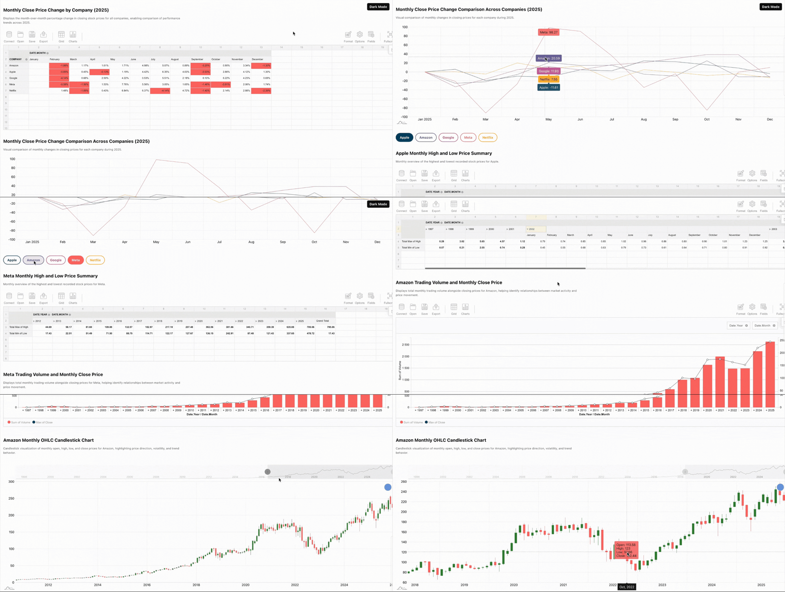
Seems like pretty much info, doesn’t it? Let’s break it step by step. Our demo consists of 2 pivot tables and 3 charts, and we’ll go through it one by one.
Monthly Close Price Change by Company
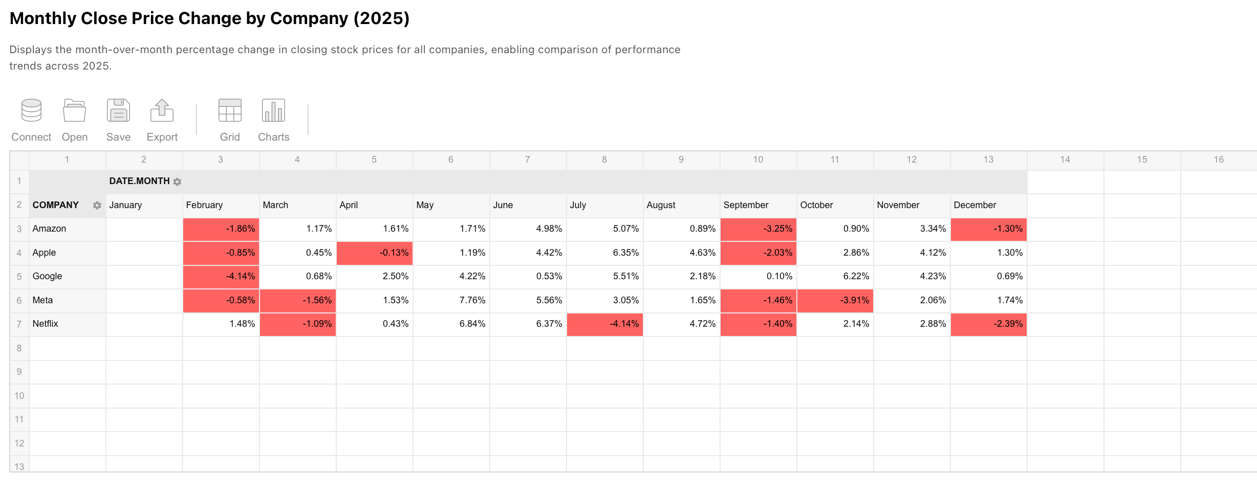
We start with a pivot table that shows the month-over-month percentage change in closing prices for all MAANG companies in 2025. This view is useful for understanding price dynamics rather than absolute values, as it focuses on how prices change from one month to another.
Using calculated measures, we can immediately see periods of growth and decline for each company. Conditional formatting helps highlight negative values, making it easier to notice months where a company underperformed. This type of table is perfect for trend analysis and quick comparison.
Monthly Close Price Change Comparison Across Companies
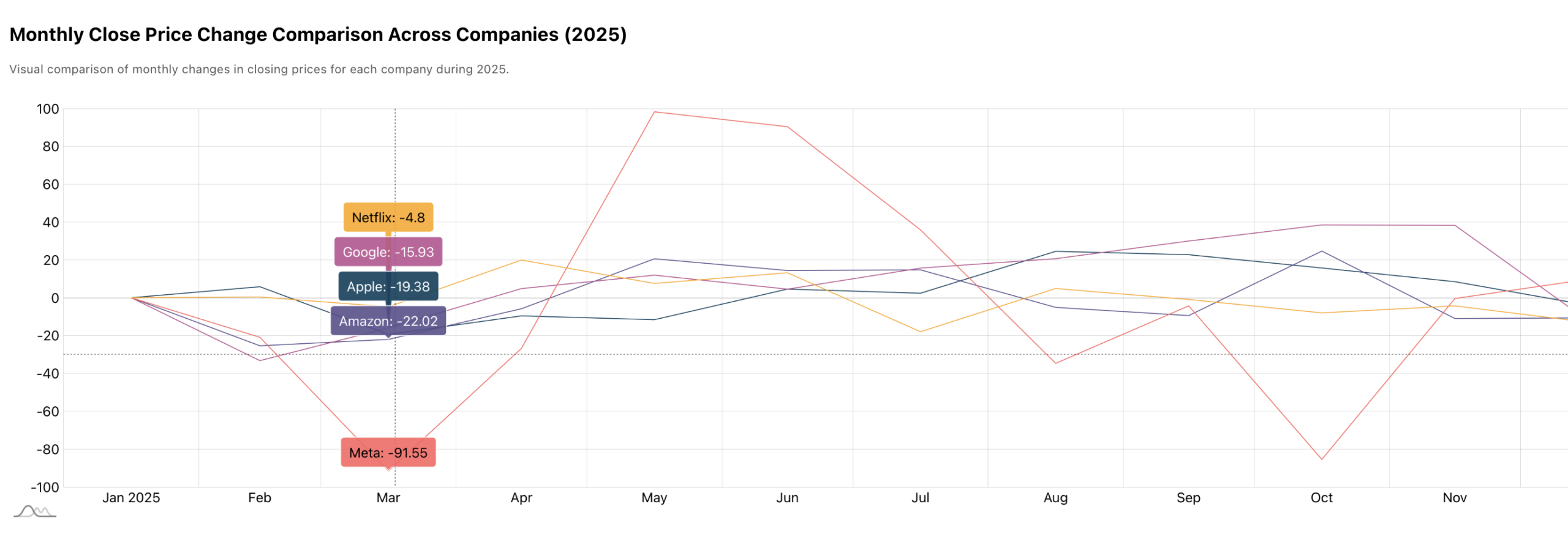
To complement the table, we visualize the same data in a line chart, with each line representing a company. For creating it, we used amCharts. Flexmonster already has a convenient сonnector with amCharts for you. Moreover, you can choose any charting library like Highcharts, FusionCharts, Google Charts, and many more that suits you; more details are available in our documentation on integrations.
This chart helps analyze relative behavior across companies, showing whether trends move in the same or opposite directions over time.
Compared to a pivot table, the chart makes it easier to identify patterns and changes. Tooltips allow more detailed inspection of specific periods, making it easier to understand market changes or seasonal trends.
After analyzing the overall picture and comparing all companies together, the demo allows switching the focus to a specific company. We added a set of buttons that let the user choose one company at a time and see detailed information about each of them. Once a company is selected, the dashboard updates and all following views show data only for the chosen company, making the analysis more focused and detailed.

Company’s Monthly High and Low Price Summary
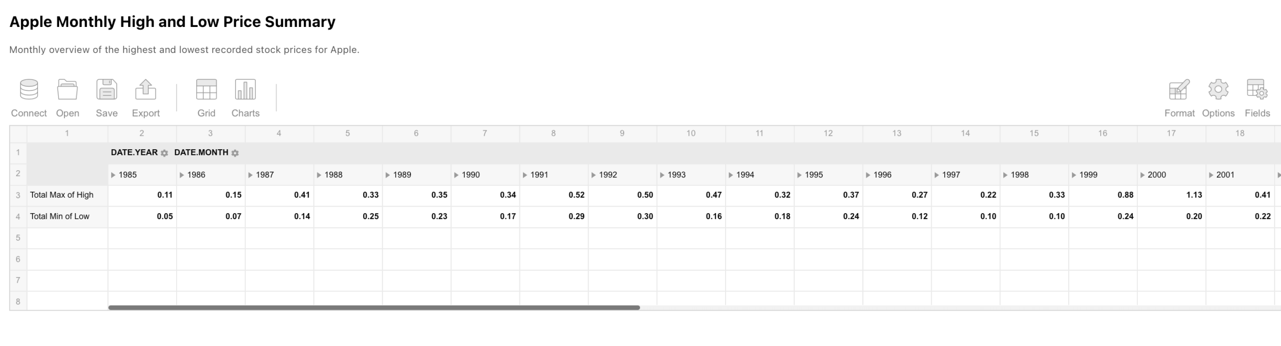
For the selected company, the next pivot table shows the monthly high and low prices. This summary helps analyze price ranges and volatility without going into raw daily data.
By aggregating prices using minimum and maximum values, it becomes easier to see how stable prices were across different months.
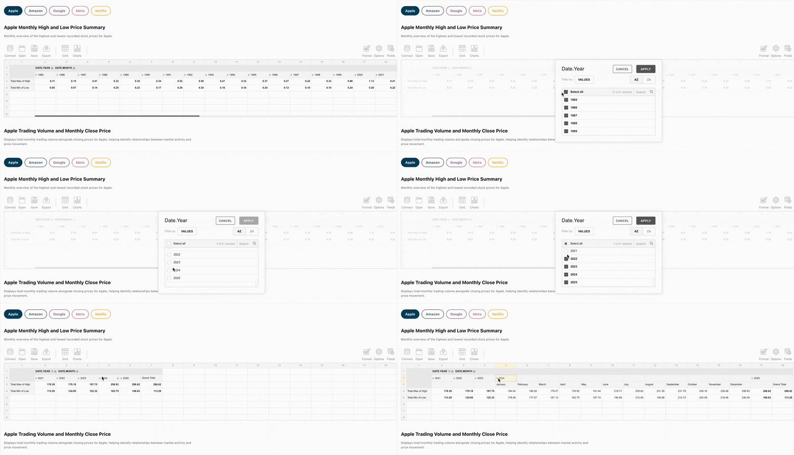
Seems like too much information for one pivot? You can easily use the UI to focus on what actually matters and hide unnessesary information. For example, if you’re interested in data only for past years, let’s display only that:
Company’s Trading Volume and Monthly Close Price
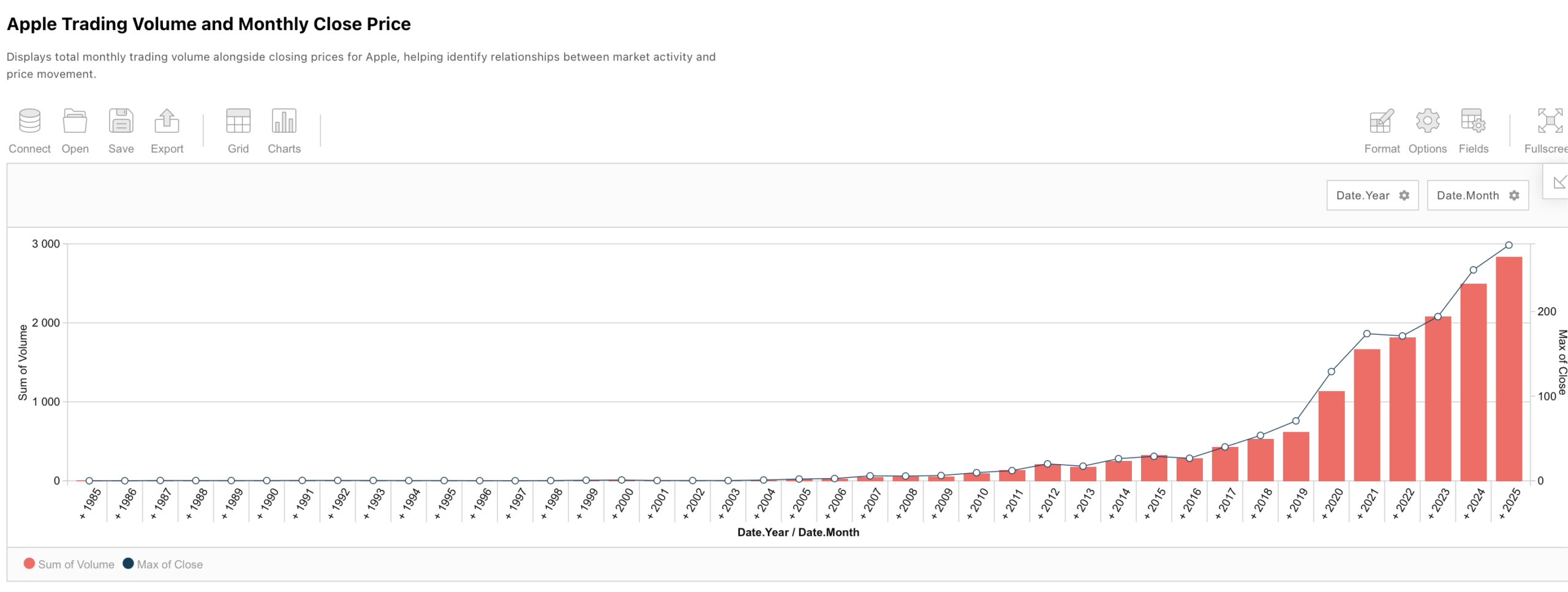
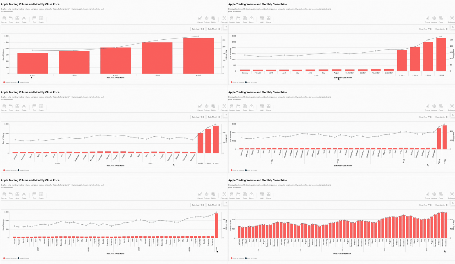
The next dashboard element is a pivot chart by Flexmonster, which shows trading volume and closing price. Displaying these two metrics together helps analyze how market activity relates to price movement.
For example, you can check if prices change: if prices are rising but volumes are falling, it might indicate that the trend is losing strength and could reverse soon. Looking at related metrics together makes it easier to notice connections between them.
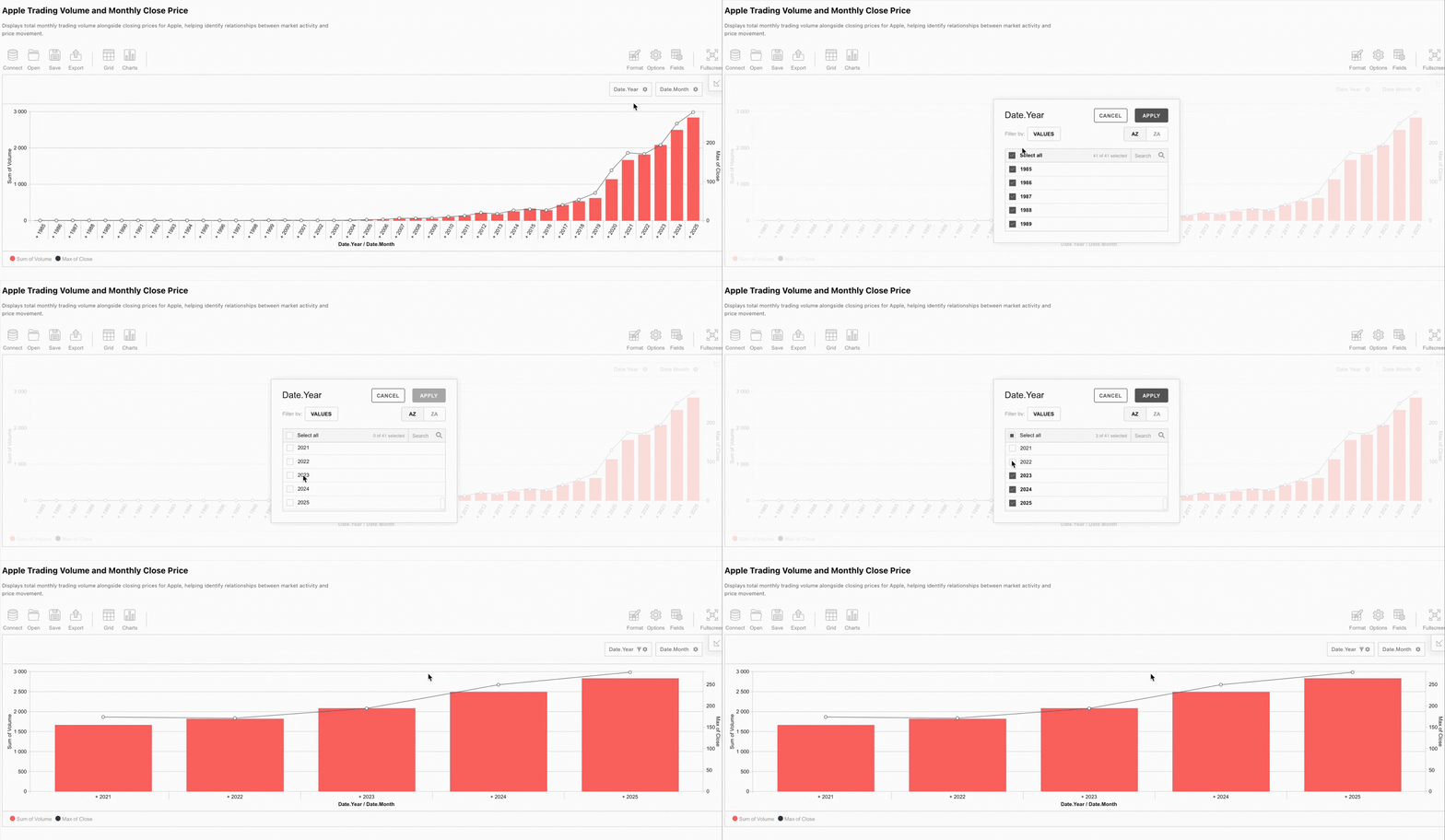
And in the same way as in the previous case, you can select a specific year range to take a closer look at the data:
Moreover, you can open yearly sections and check the info for every month. Scroll through the data however you want.
Company’s Monthly OHLC Candlestick Chart
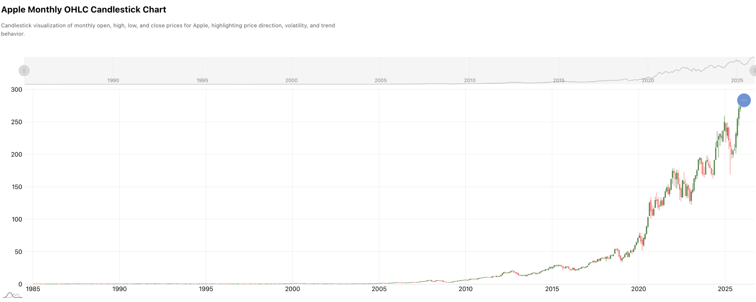
Finally, the demo includes a candlestick chart that shows open, high, low, and close prices for the selected company. This visualization provides a more detailed look at price behavior over time.
It is worth noting that the candlestick chart data is sourced directly from the Flexmonster Pivot Table, which serves as our high-performance data engine. By leveraging Flexmonster's advanced processing power, we pre-define and structure the dataset to ensure seamless rendering within the candlestick visualization.
Candlestick charts are probably among the most widely used in trading analysis because they clearly show price direction and range within each period.
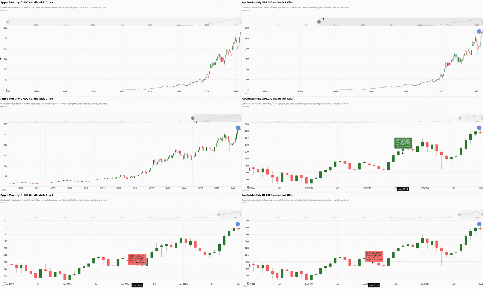
You can also scroll through the chart by time using the amCharts built-in horizontal scrollbar, making it easy to explore any date range you want.
And now, as a final step, we decided to improve the usual control. Our dashboard includes a light/dark mode toggle that lets users switch between themes based on their preferences or working environment. For the pivot, we’ve used the built-in Midnight theme, which can be applied with just a few lines of configuration. Moreover, Flexmonster offers 18 built-in themes, so you can easily choose the one that best fits your project. But if none of them fully fit your project style, you can always create your custom theme and fully control your pivot design.
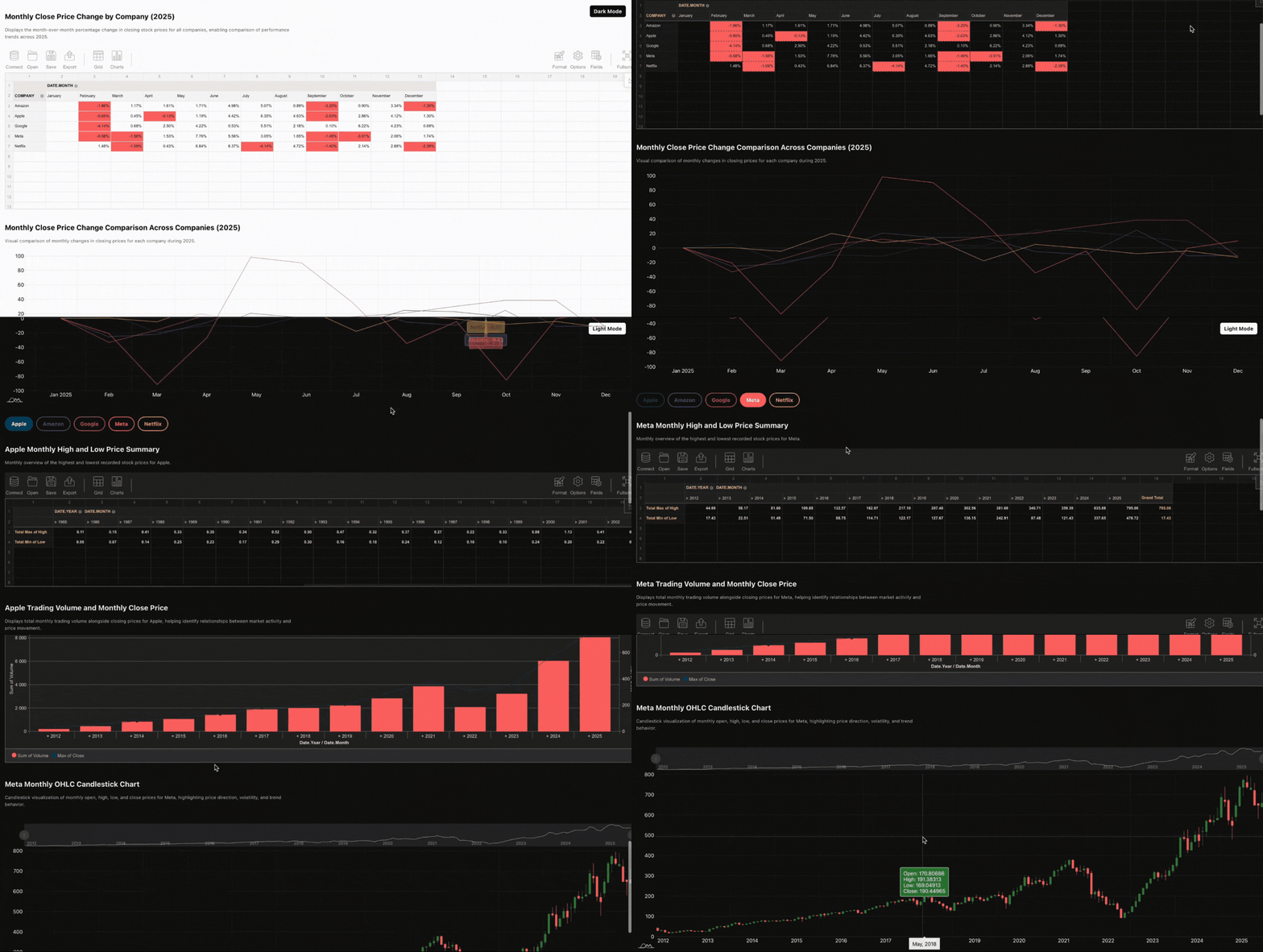
So, Flexmonster helps turn raw stock data into meaningful insights, allowing you to quickly spot key trends. Whether you’re comparing companies or tracking price movements, the dashboard helps you quickly understand the data. It’s not just about the numbers; it’s about tracking changes, understanding the data, and spotting insights.
By combining just two powerful libraries, you can already cover the kind of analytical tasks that are usually handled by complex and expensive full-scale solutions like Tableau or Power BI. And this setup is just the beginning, it can be easily extended depending on your needs.